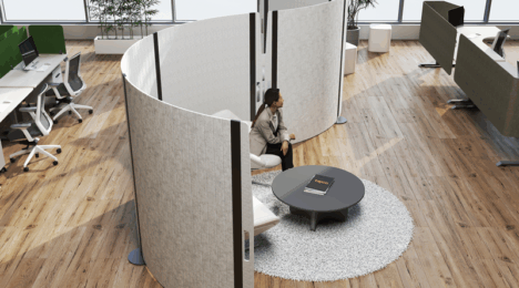
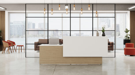
In the world of contract furniture, overlooking the diverse spectrum of body types when specifying furniture can lead to more than just discomfort – it can result in the exclusion of a vast range of potential users.
Today I’d like to share a conversation I had with Bill Melnik, the CEO of Tayco and BRC, esteemed Canadian manufacturers of casegoods and systems. Our discussion shed light on the crucial importance of considering every BODY in the workplace. While no two bodies are the same, we often categorize them into percentiles, such as the 90th or 95th, leaving behind those who belong to the often-overlooked 10th percentile.
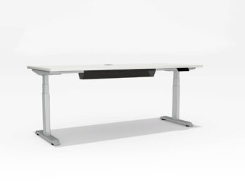
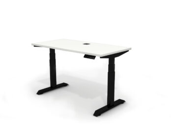
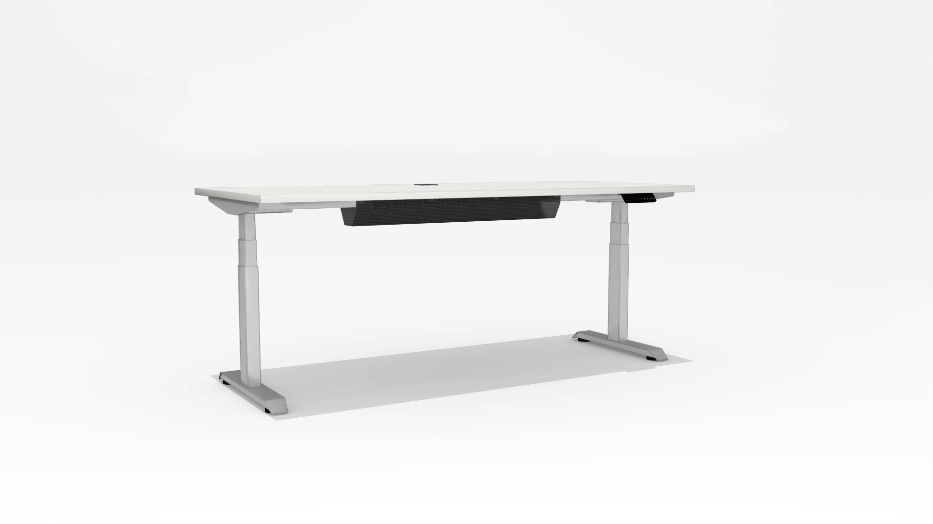
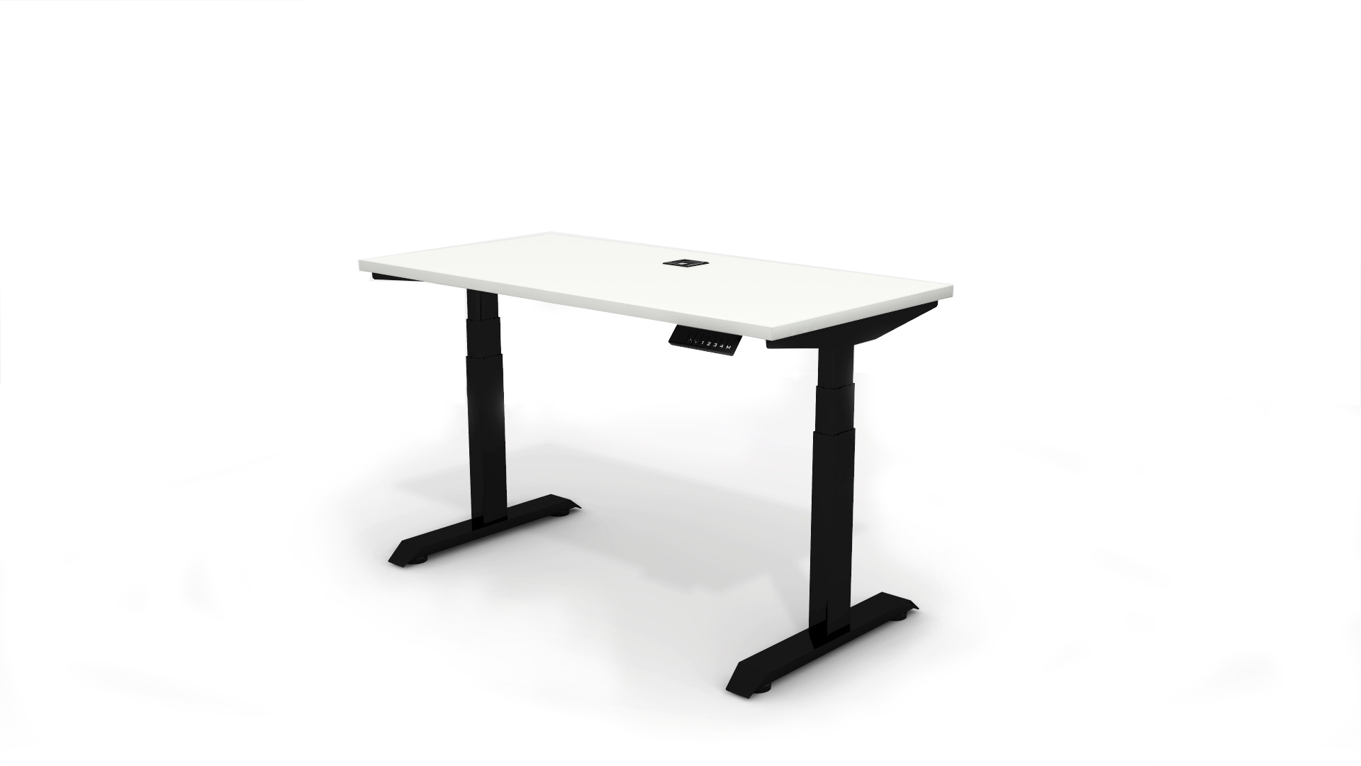
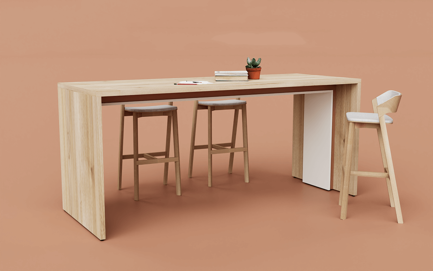
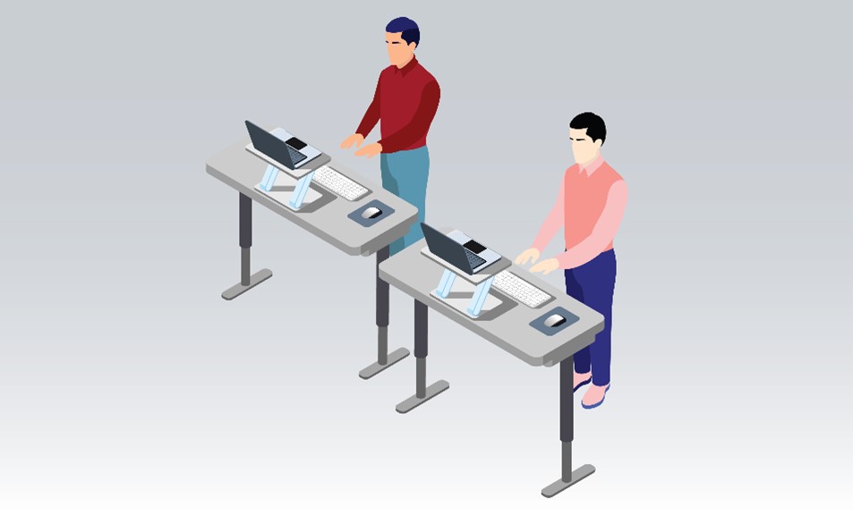
To set the stage, consider the recommended height range for standing desks, which typically spans from 22.6” to 48.2” (these measurement standards are provided from BIFMA and the US Government). This range is designed to accommodate 90% of the US population. But if you’re like me and struggle with measurements, take a moment to grab a measuring tape and visualize 22 inches off the ground. Then move the measuring tape to 48 inches. This might seem like a large range to work within; however many tables don’t even conform to the 90th percentile, let alone make accommodations for the 10% of the population still can’t use the table ergonomically.
To delve deeper, I turned to my CEO, Bill, for insights into ergonomics and its role in design. Our discussion unearthed more than just measurements, here are some key takeaways.
Misti: Can you provide an overview of what ergonomics is and its significance in design?
Bill: Ergon means work, and nomos means laws. Essentially, ergonomics is the “laws of work” or the scientific study of people in the workplace. It’s about truly understanding how humans interact with work. Our bodies are designed for constant motion, and we are healthier and more productive when we find ways to keep our bodies active. When designing for ergonomics, we must consider the body and the various tasks it performs throughout the day. It’s about achieving great style, great design, and ensuring that people can stay active.
Misti: How does ergonomic design contribute to creating more inclusive products and spaces?
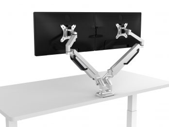
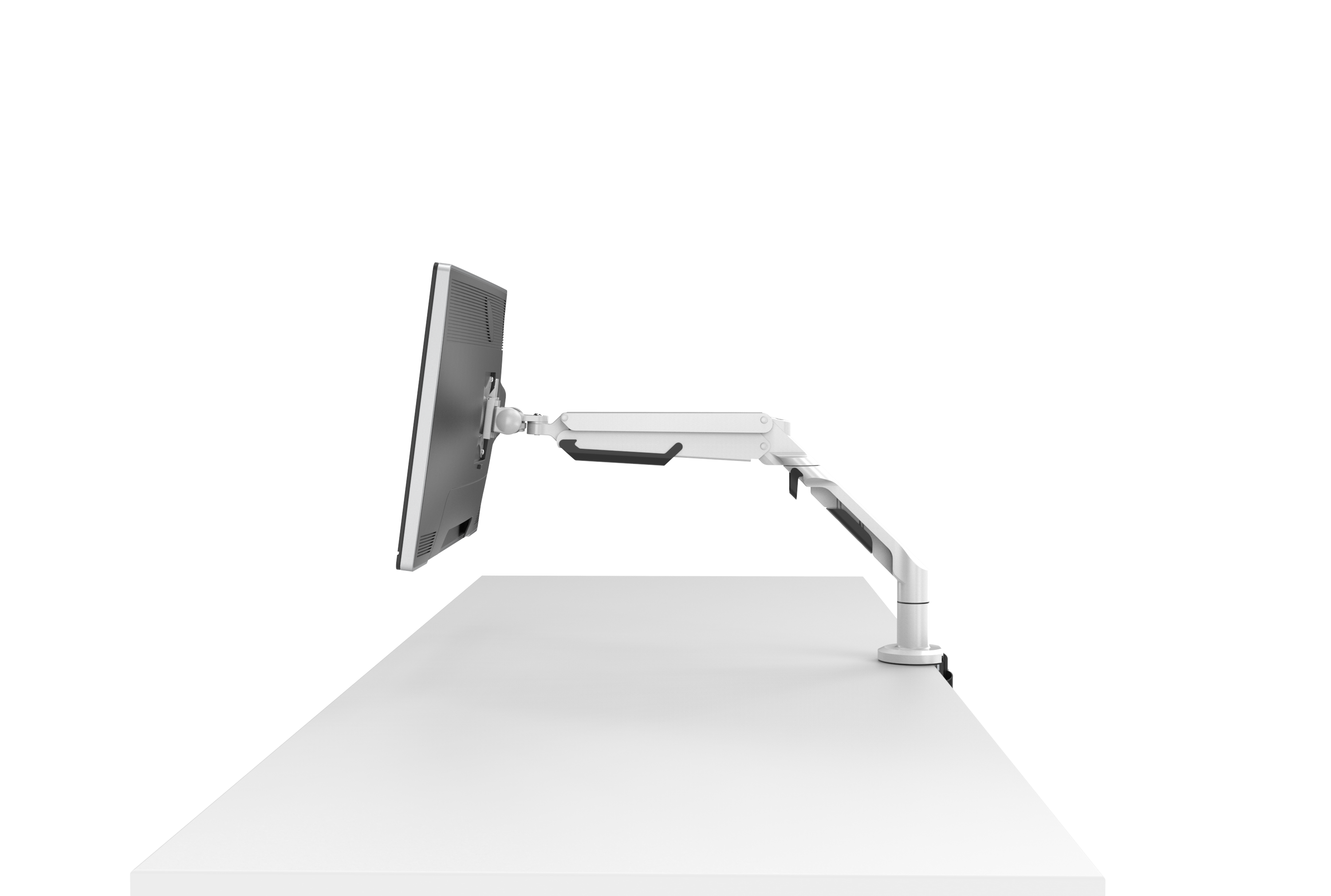
Bill: A well-designed ergonomic space caters to seating, working, vision, and storage, adapting to the diverse range of human bodies that will occupy it. For instance, when a workspace involves staring at a computer screen, that screen must be adjustable for different eyesight’s, glare-free, and scalable, not only for body types but also for varying vision strengths. Poor ergonomic design is a significant contributor to workplace accidents. For example, two people can be the same height yet have different arm lengths, so manufacturers should strive to accommodate the 90th percentile to ensure inclusivity.
Misti: What are some common challenges designers face when trying to incorporate ergonomic principles into their work?
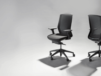
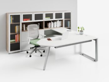
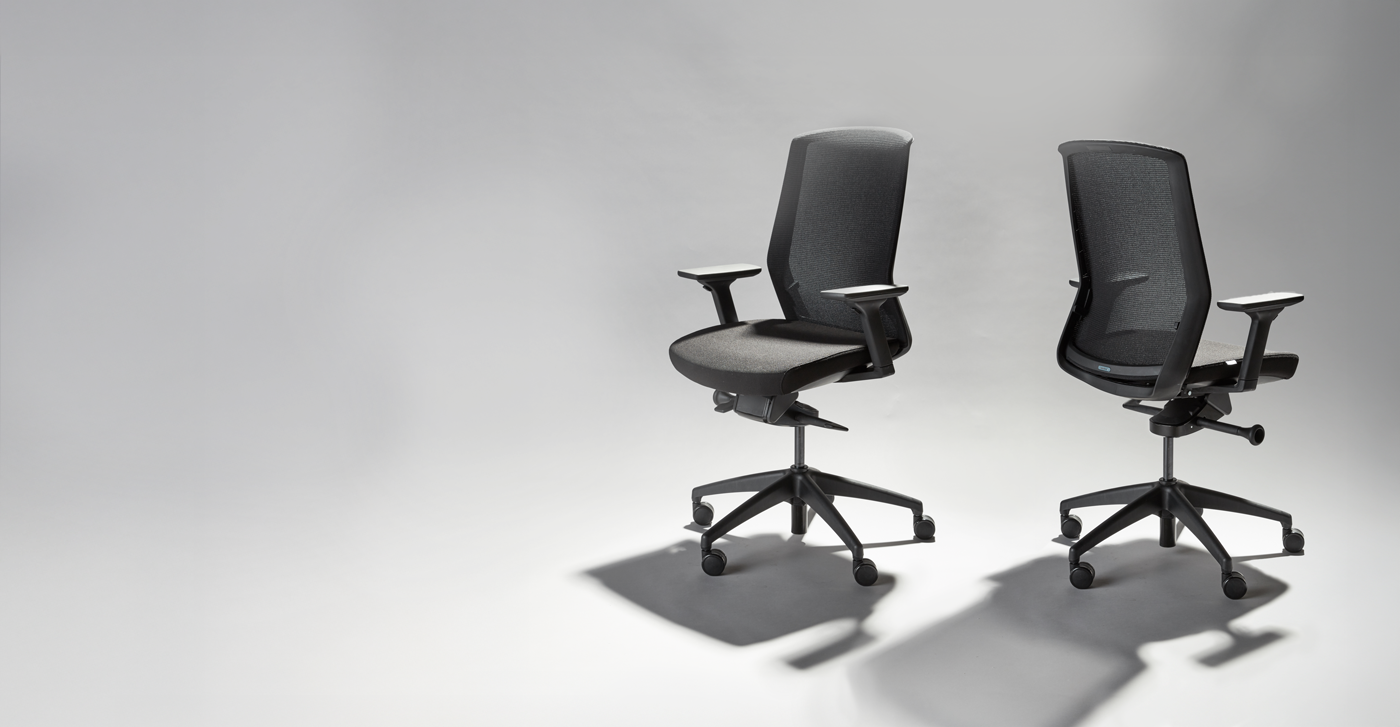
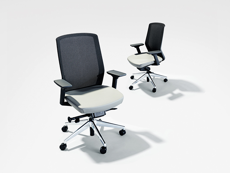
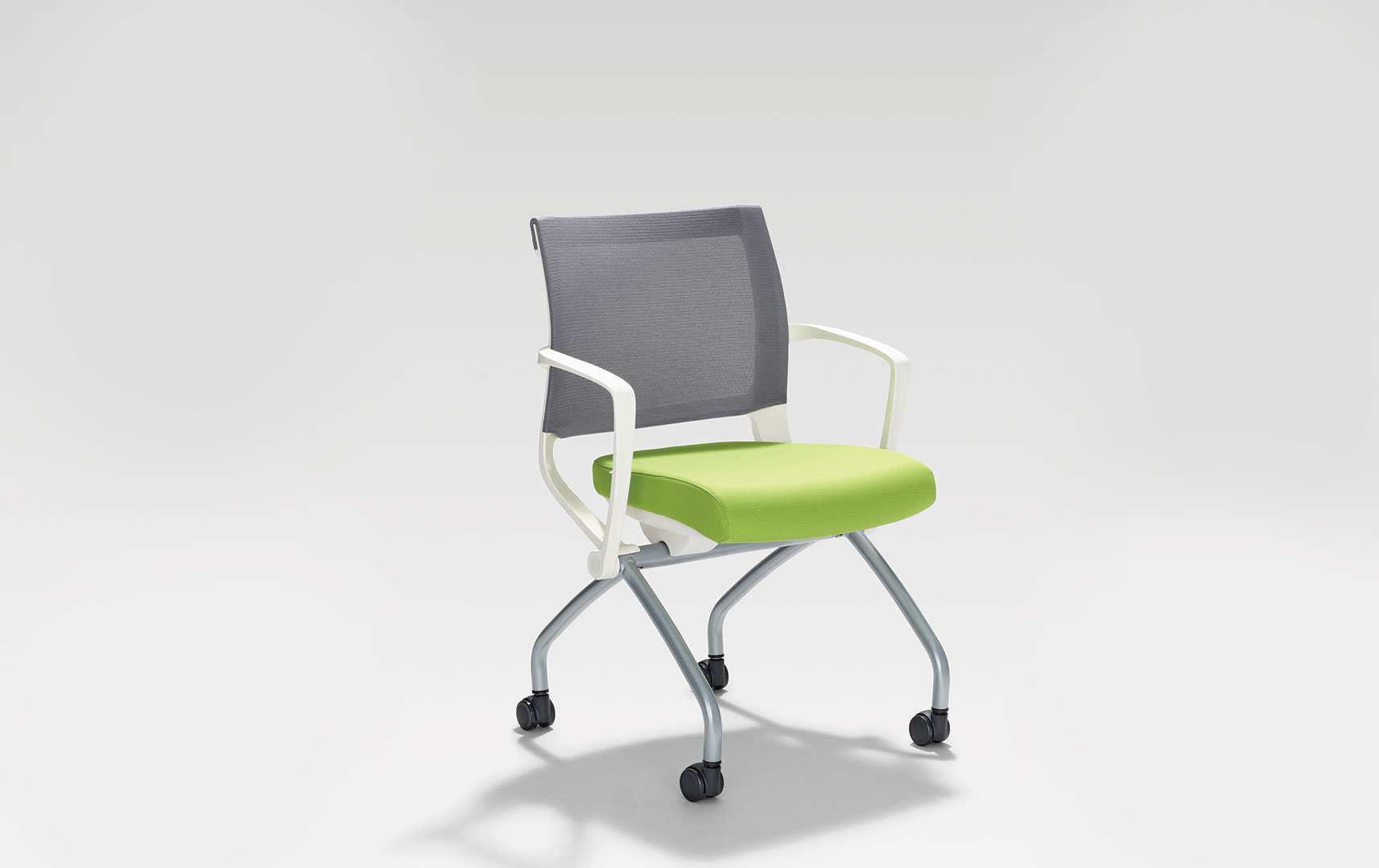
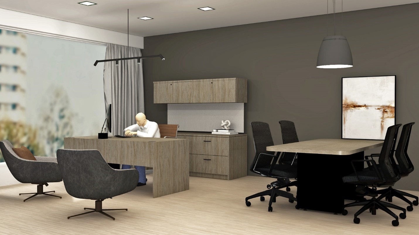
Bill: The availability of well-thought-out products that support the environment. For example, there are countless chair options, but if a chair cannot adjust low enough for someone with short legs, they either need to seek another chair or understand the issue to find a suitable solution. Specifiers must have a deep understanding of ergonomic principles to provide the right solutions. There’s often a conflict between the perceived perfect workspace and the best ergonomic design. If we look at an executive office, designers and end users perceive a certain look; credenza, executive desk, seating, conference table etc. However, it may not be practical at all if you do not understand the end user who will be occupying that space. Rarely are they the right person for the desk chosen. To truly serve users, it’s essential to grasp the measurements of the individual who will occupy the given space.
Misti: How do we approach designing for users with varying physical abilities and limitations at Tayco?
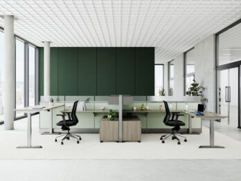
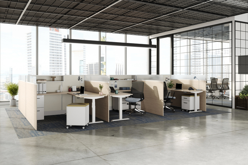
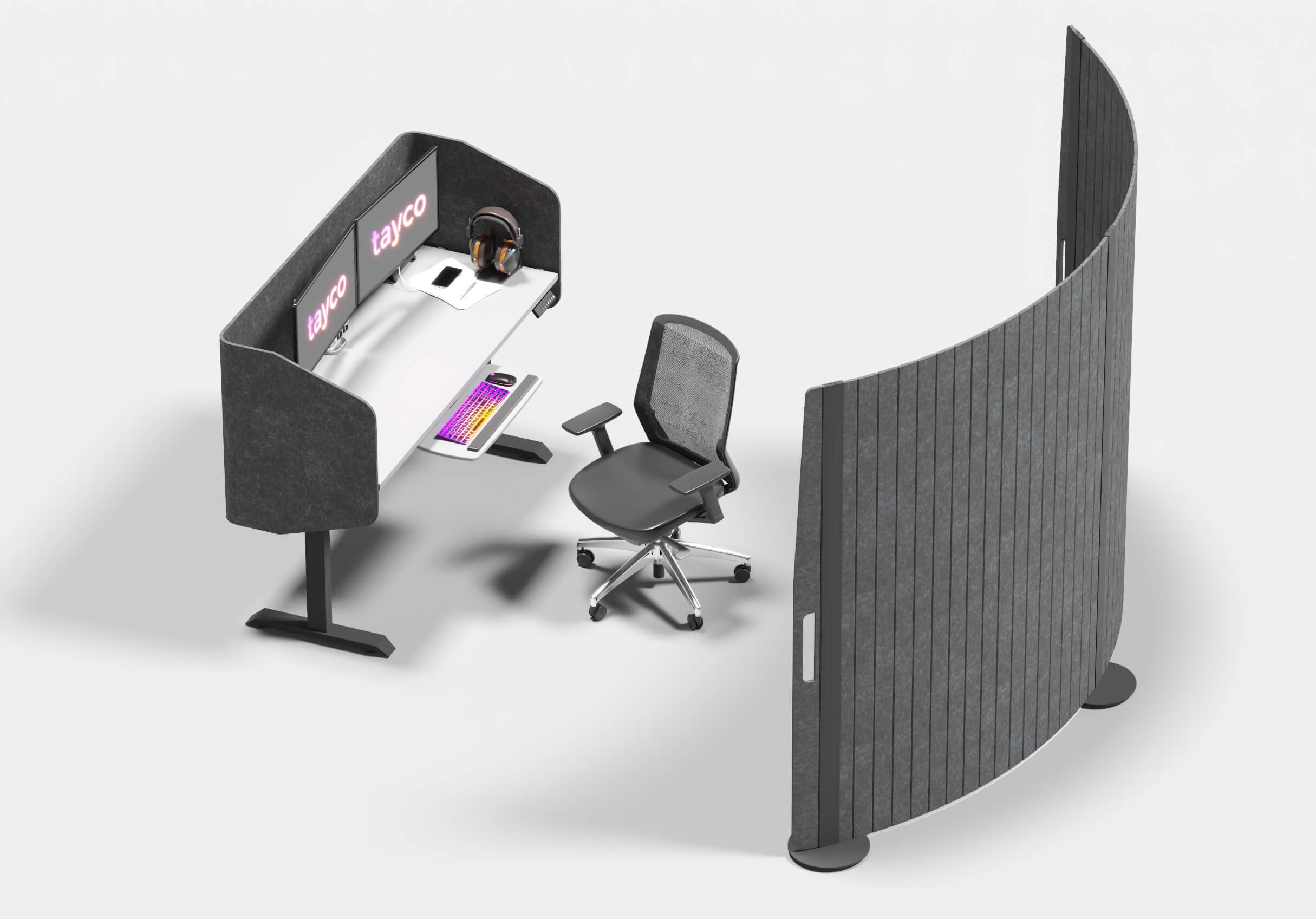
Bill: Our top and first priority is to incorporate height adjustable products into the environment. We consider the mix of storage and work surfaces, ensuring that the height adjustable tables can accommodate all individuals. We try to think, can we setup this desk as efficient as possible for any body using it? Sometimes, clients have budget constraints or a dealer/designer wants to sell what is on their floor, and they opt for products that may partially accommodate different body types. While budget-friendly options exist, they generally do not cater to everyone. This doesn’t mean that the specifier doesn’t care, it may be a lack of knowledge or product offering.
Misti: Are there specific guidelines or principles that designers/specifiers should consider for inclusive ergonomics?
Bill: Absolutely, yes. Task surfacing should span the lowest lows and the highest highs to cater to different body types. Some individuals may need a worksurface as low as 22”, requiring designers to think beyond traditional measurements.
People need to feel comfortable in what you provide them, at the capacity that their body is most comfortable doing.
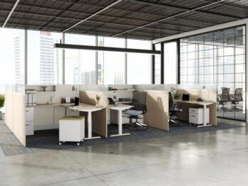
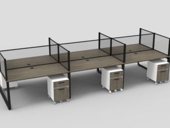
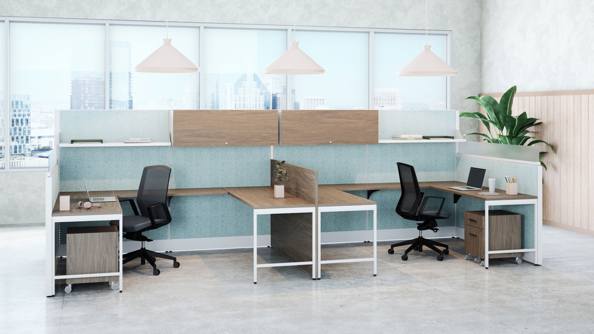
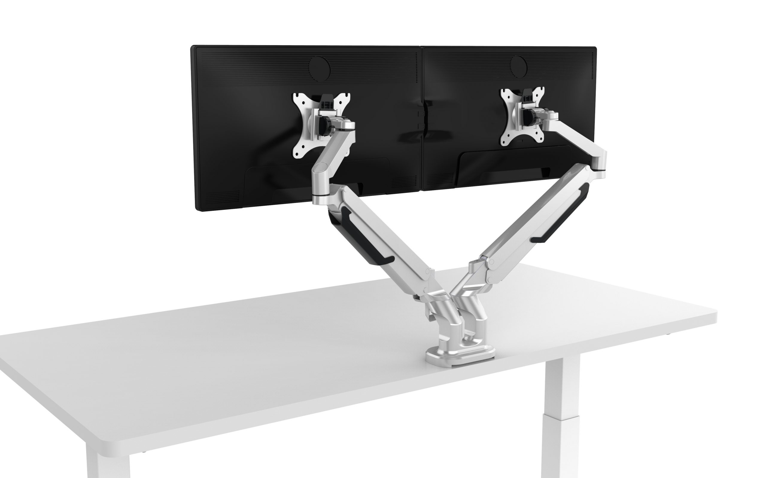
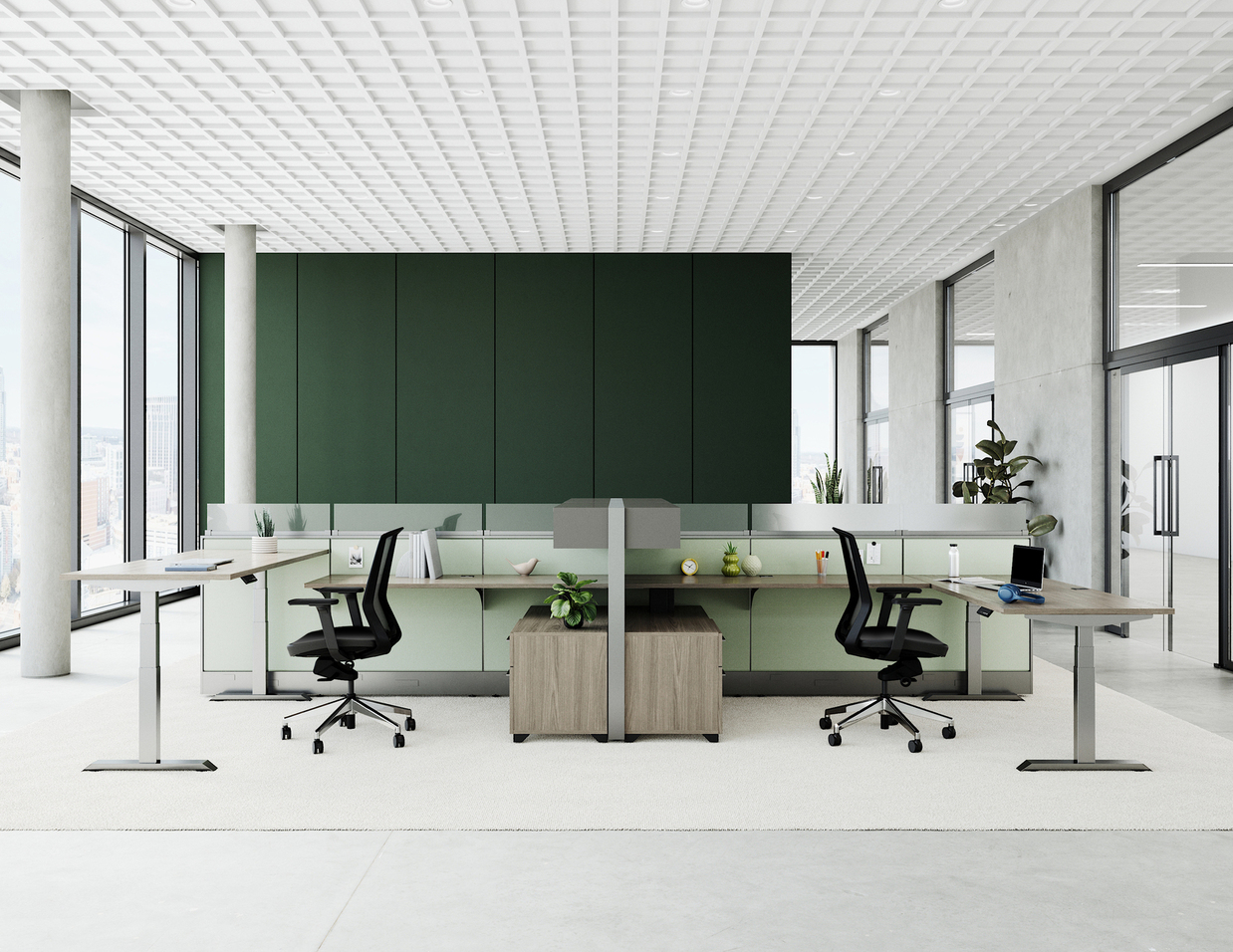
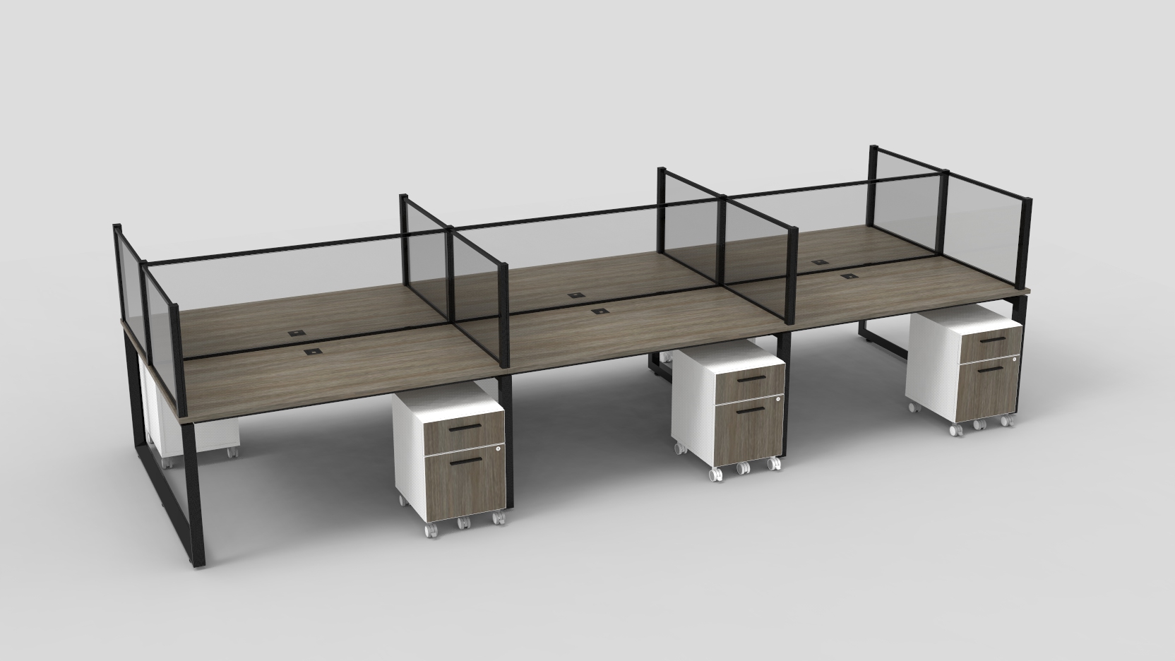
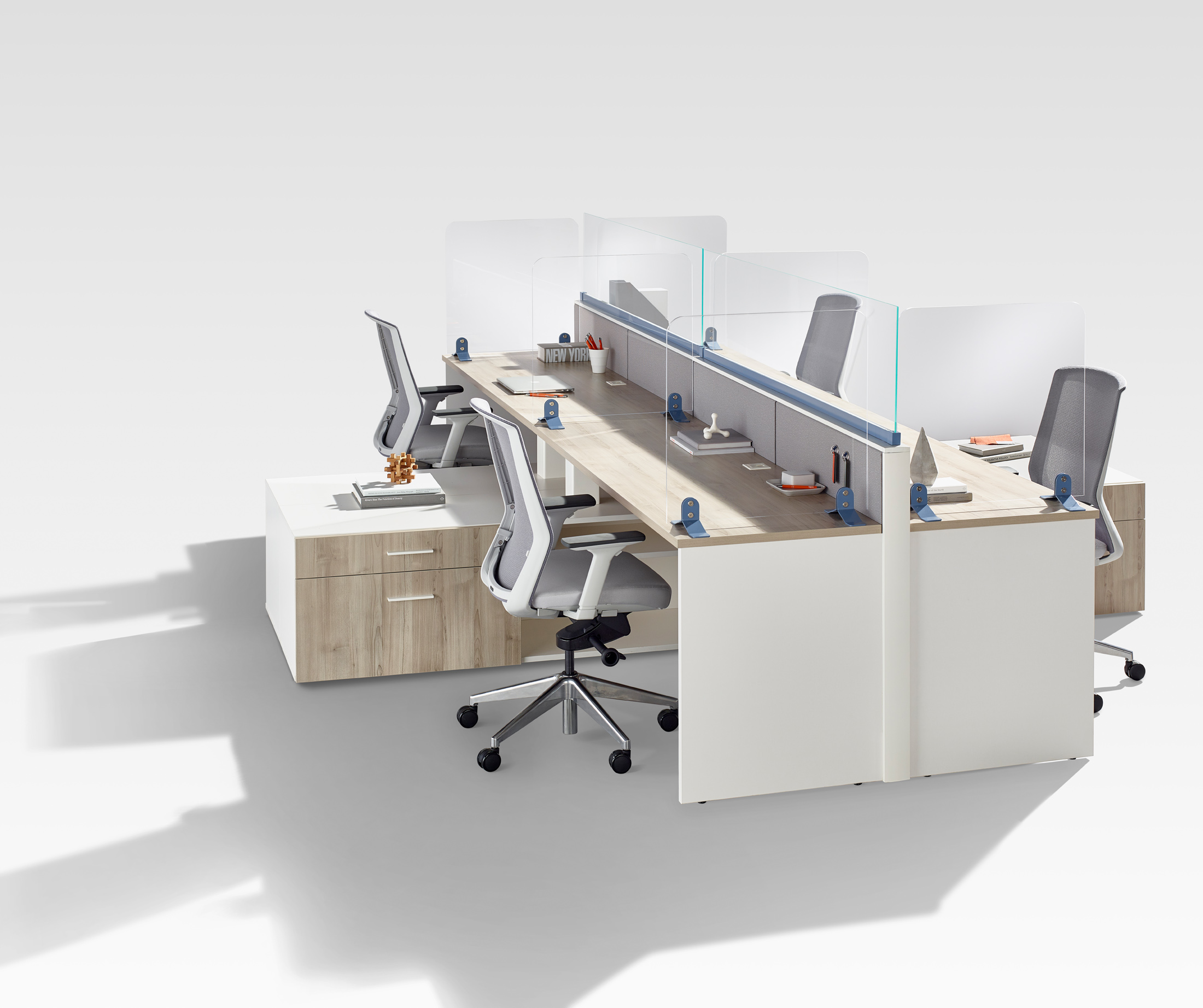
For example, let’s say there is a benching station, if you have a very tall person working back-to-back with a very short person, you need to accommodate them. You have to provide for them, so they don’t feel awkward sitting or standing. Age and vision capabilities need to be adaptive to an inclusive workstation, is the person sitting at the station able to grab and pull their screen toward them. (Laptops are not inclusive). A monitor isn’t just proximal- closer and further away, but brightness/glare, can you influence them? It’s not just a work surface, not a monitor, not just your chair, not just reaching for your shelving, it’s making sure that these can accommodate different body metrics.
Misti: Can you discuss the relationship between aesthetics and ergonomics in design, particularly when creating visually appeal yet inclusive products?
Bill: Rodney Dangerfield said “it’s better to look good than to feel good,” which brings to mind the importance of aesthetics. However, we can flip this statement to emphasize that you can both look and feel good. A wide range of fantastic chairs, executive desks, and aesthetically pleasing options are available if you allow design to explore them. The easiest example would be, don’t sucked into the trendy inexpensive looking chair that pops up in your social media feed, because it likely was not designed to adapt to any body type, and you won’t be getting close to the 90th percentile. Do not get stuck in “it’s better to look good than to feel good”, with respect to design.
Misti: What advice would you give to designers looking to incorporate ergonomic principles into their work for more inclusive designs?
Bill: Think about the body in motion, think about everything a moving body requires spatially, ease of control and adapting to what that workspace is designed to do.
Don’t be satisfied with the status quo!
Think, how can I keep this body in motion?
How can I encourage them to stand and sit throughout the day?
How can I lessen their reach?
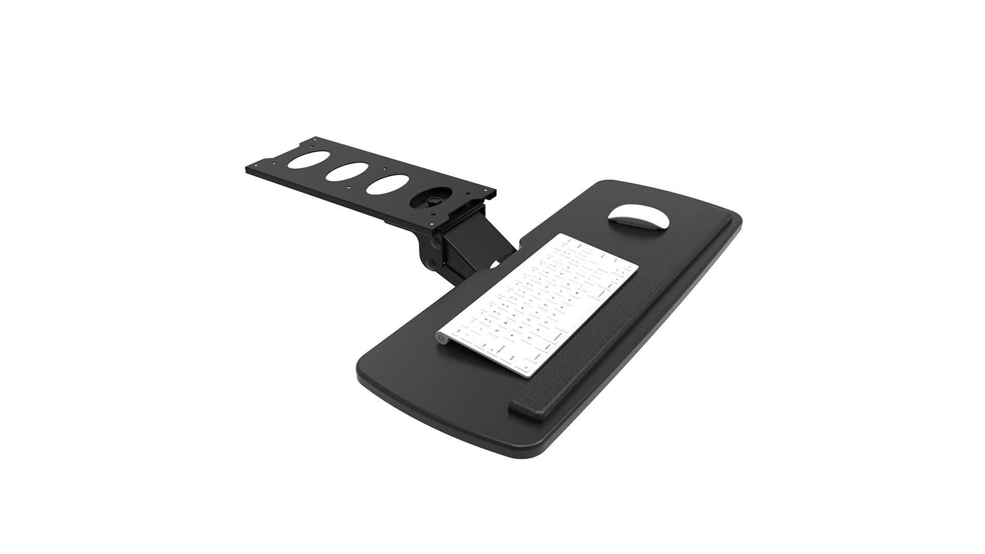
How can I lessen their joint compression, like doing typing all day?
How can I help them with their vision no matter what they are doing in that work cell?
Remember, it’s about looking good and feeling good simultaneously.
I hope you found something out of my conversation with Bill that perhaps you did not previously know, or maybe you looked at inclusivity in ergonomics through a different lens. As we strive to create environments that empower every individual, we must embrace the idea that diversity goes beyond appearance and extends to the unique needs of each body. By taking the extra steps to understand, accommodate, and inspire movement, we not only enhance comfort and productivity, but also CHAMPION INCLUSIVITY. It is a journey toward designs that not only look good but also make everyone feel good- a future where furniture isn’t just functional or just beautiful, but truly for everybody.
Author: Misti Yeager
