Risk & Insurance Consultants Case Study
The Challenge
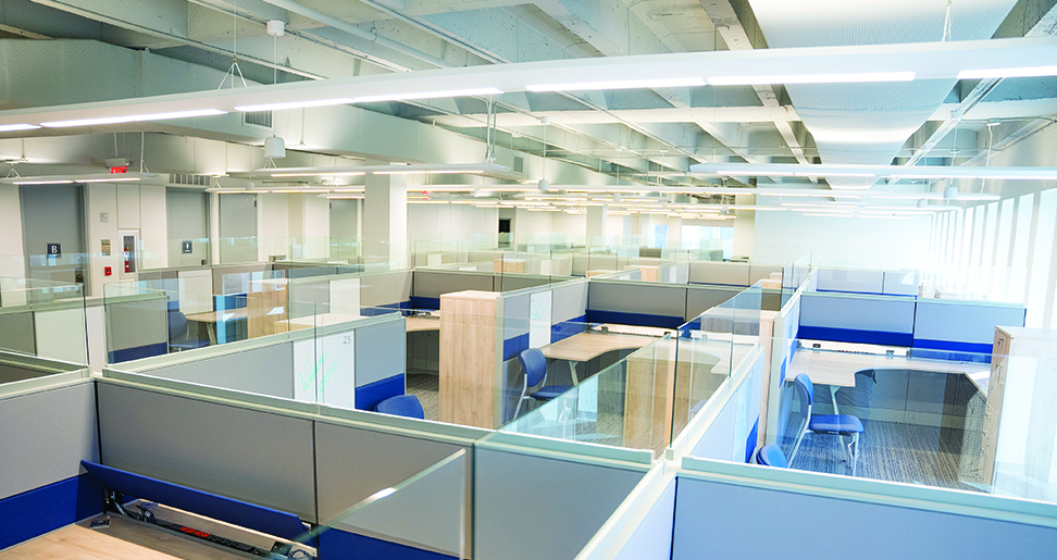
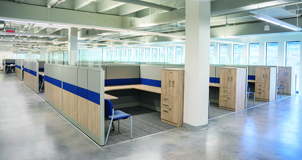
R3 Office Solutions was tasked with designing and installing a new collaborative, yet private workspace for Risk & Insurance Consultants office when they turned to the Cosmo line at Tayco. Prior to the install, Risk & Insurance Consultants had a variety of different furniture types in their office, but they wanted something that looked more cohesive and modern to go with the unique features of their building structure, which included columns and concrete floors.
The Solution
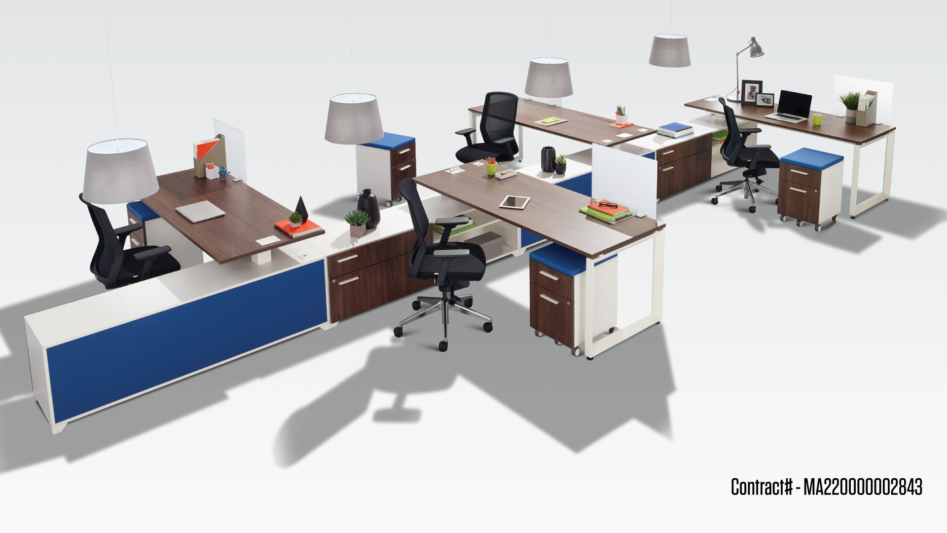
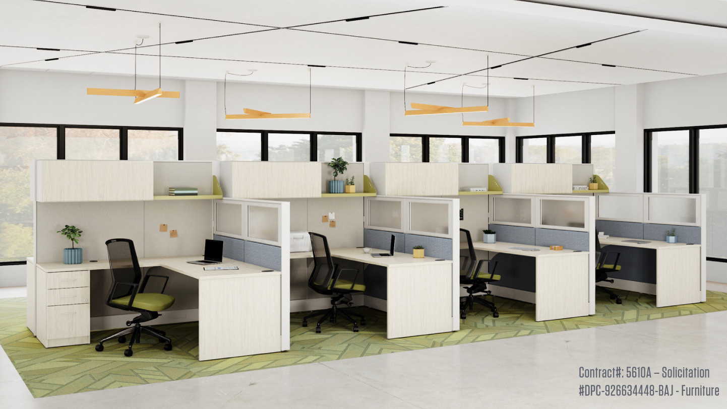
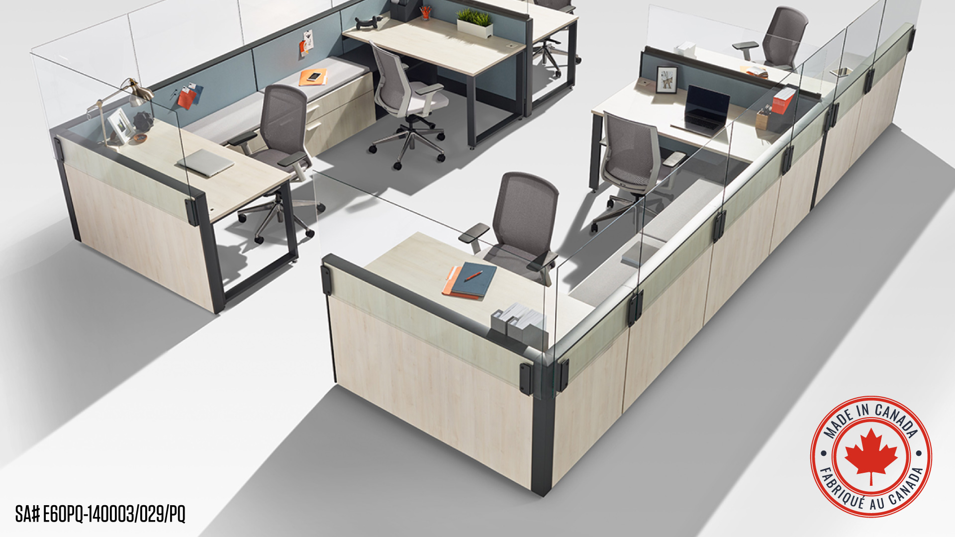
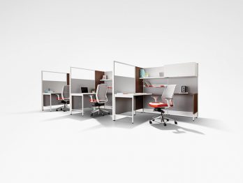
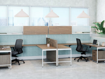
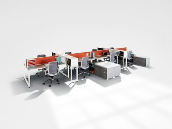
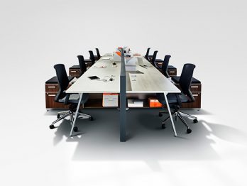
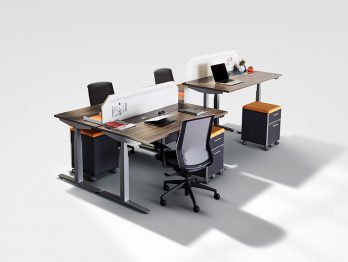
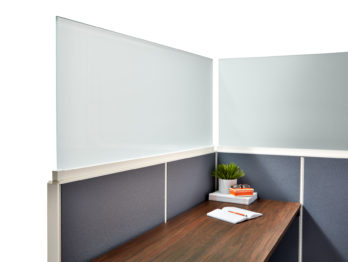
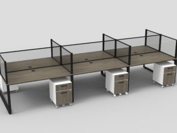
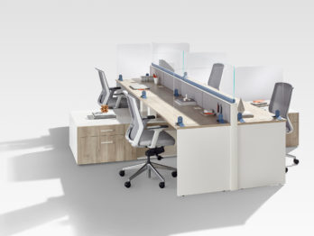
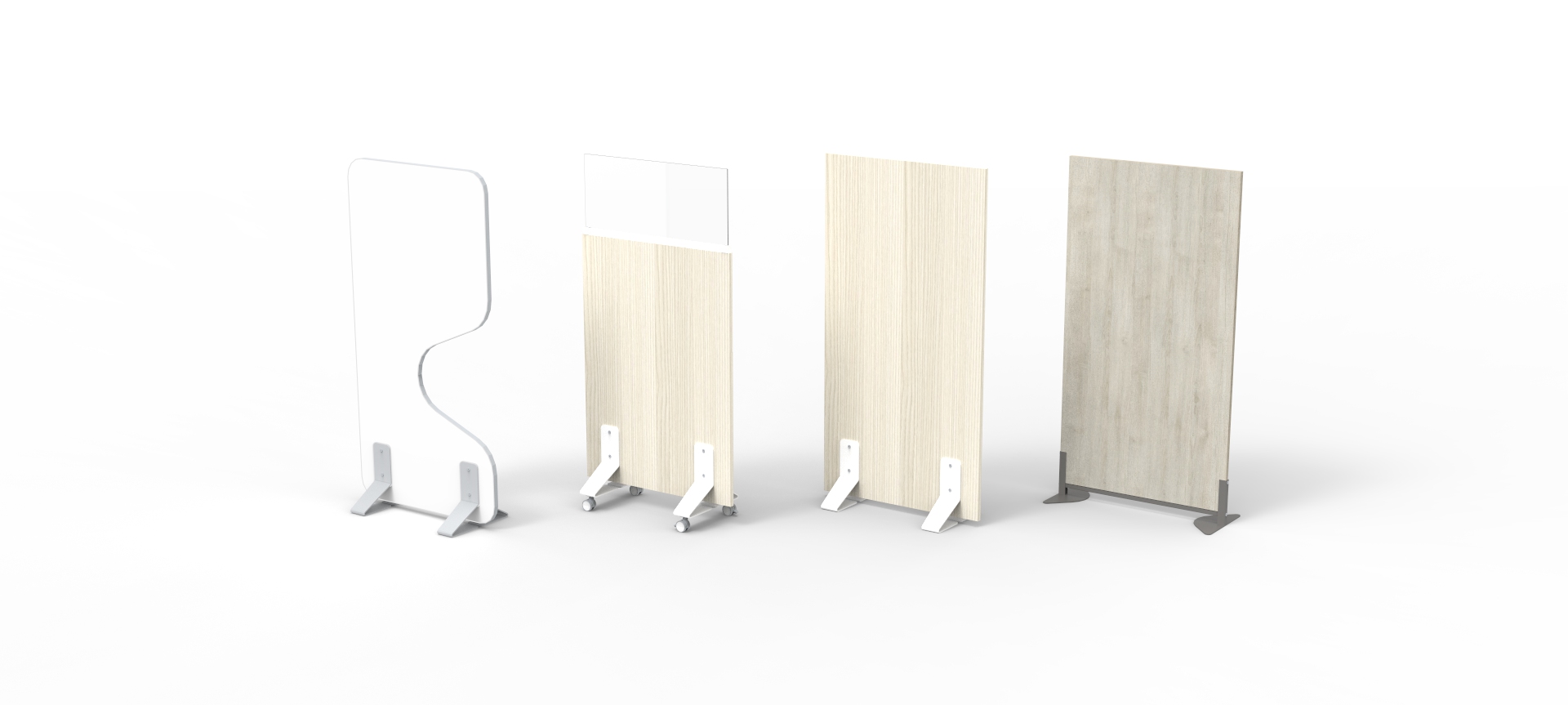
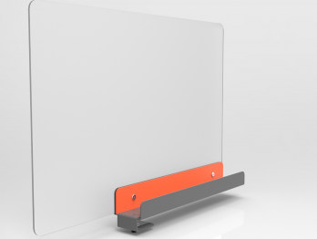
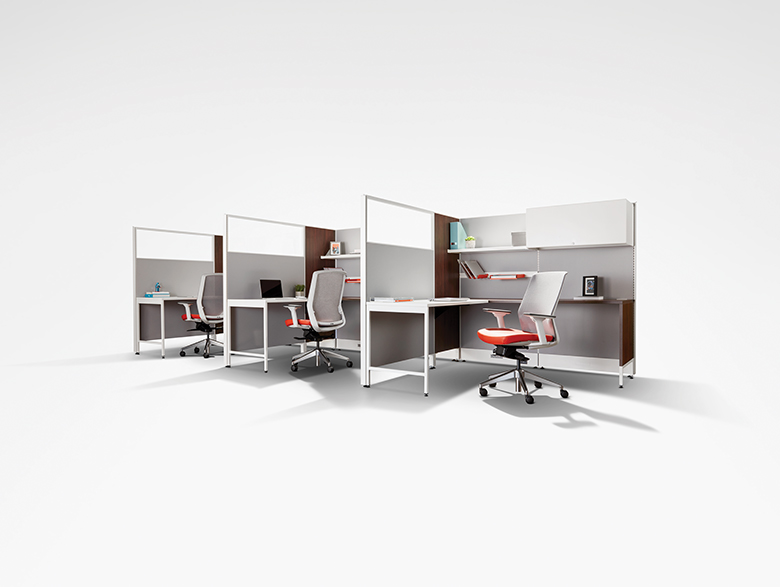
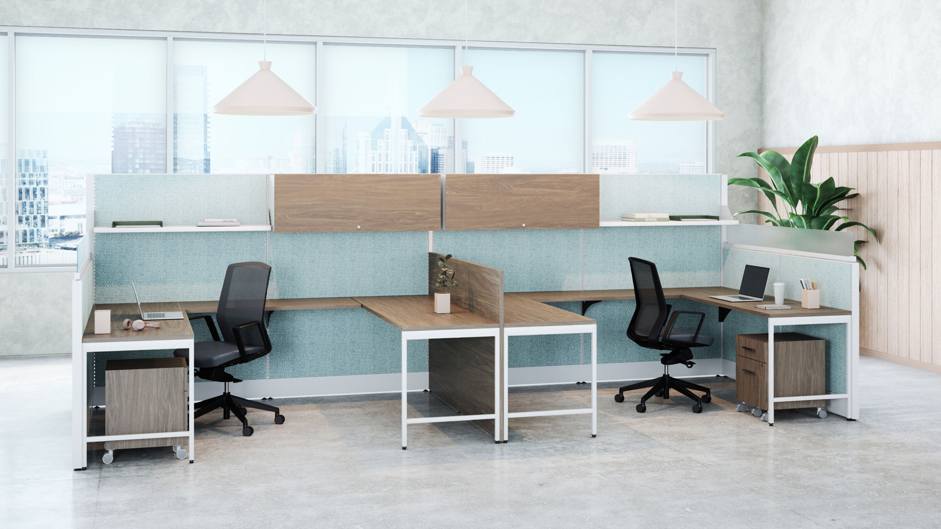
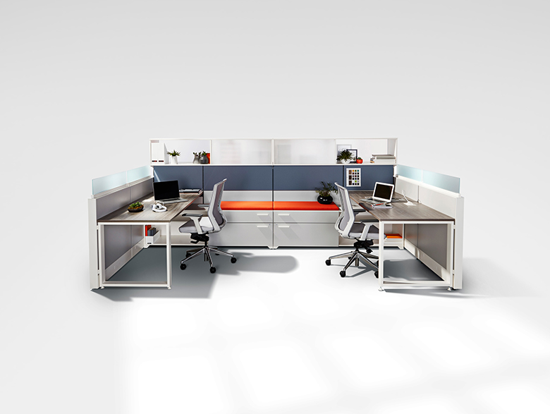
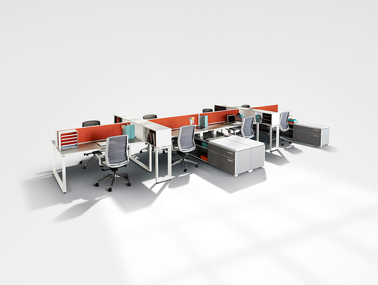
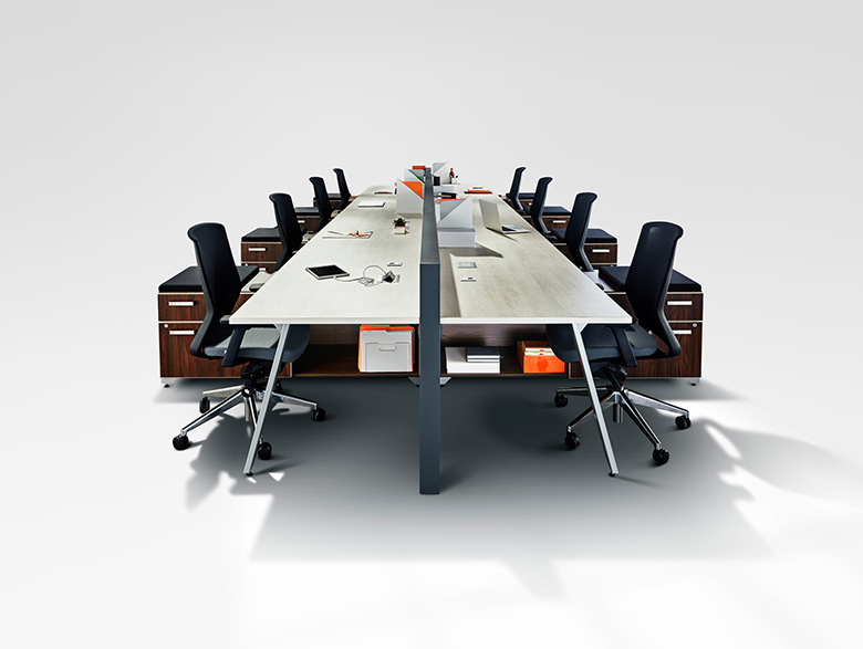
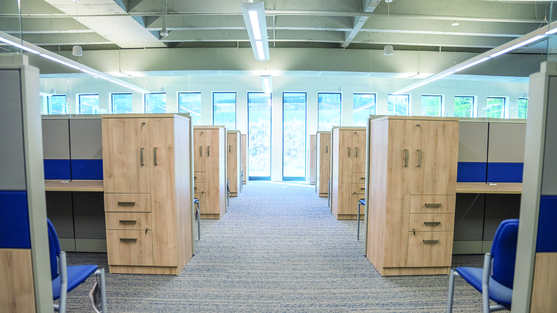
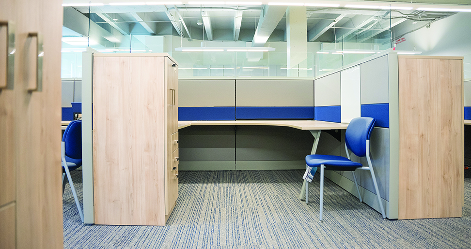
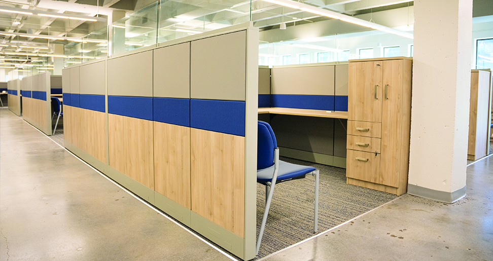
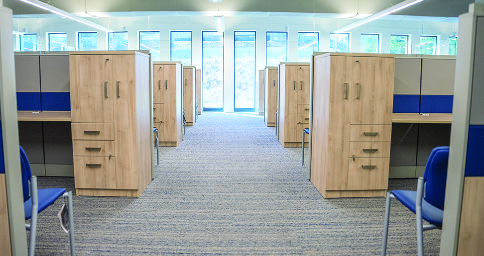
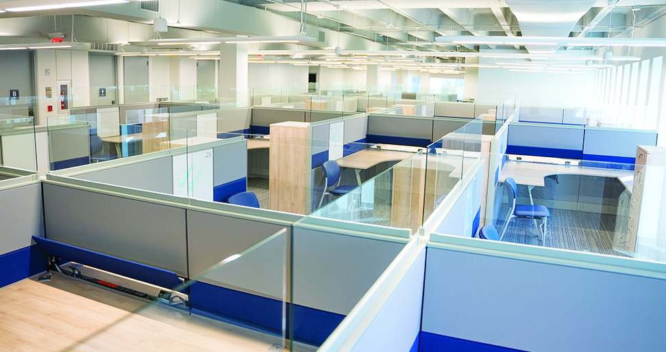
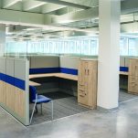
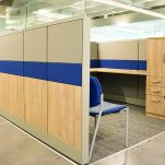
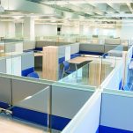
28 Cosmo stations were configured to each be 8’×8’ were created using 53” H panels with segmented tiles and 16” H clear tempered glass tops. These were perfectly picked to match the modern flair of R3’s brand. Risk and Insurance Consultants office now has a sense of flair and modernity. Sable Island laminate, grey trim and crown blue fabric allow the units to really pop in the new space giving the office a sense of pride knowing that they are surrounded with company colours.
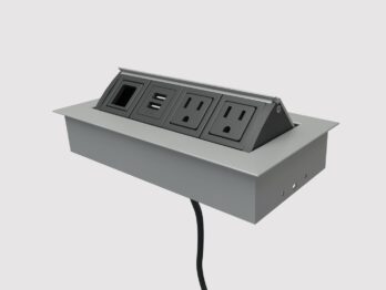
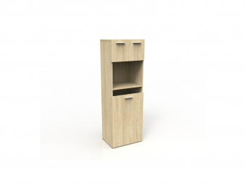
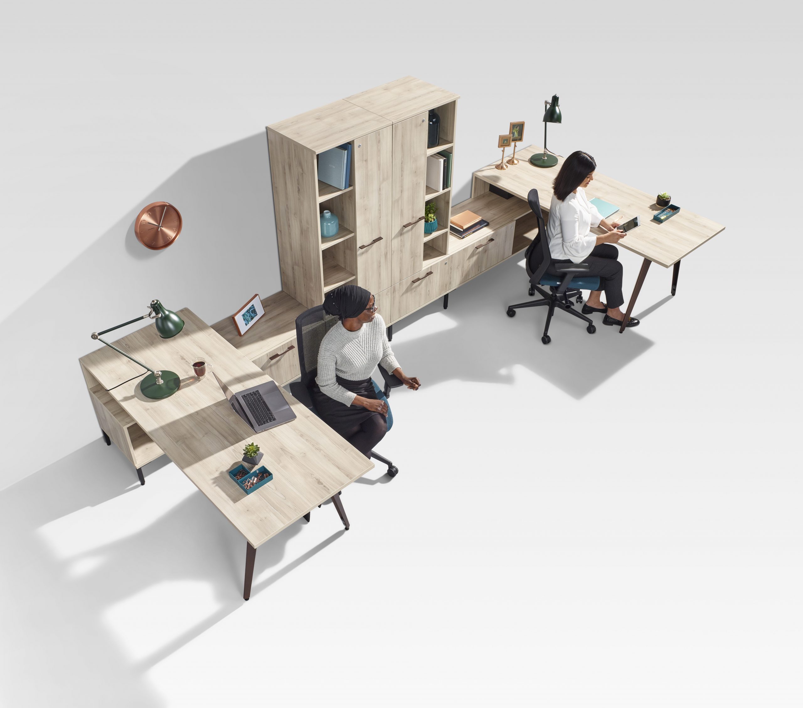
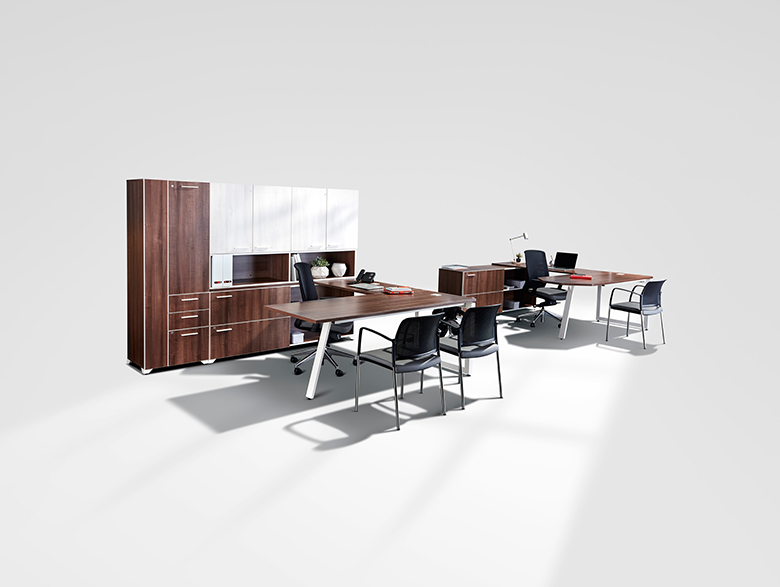
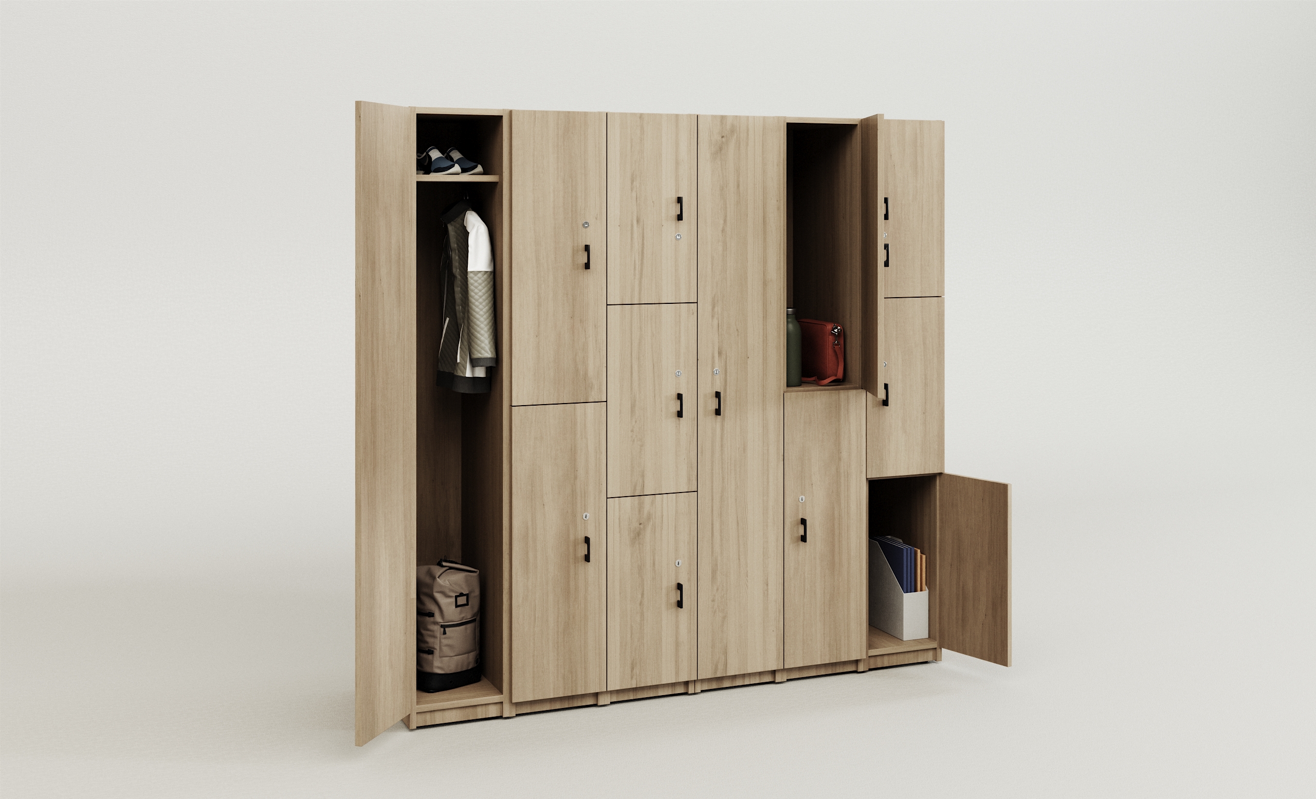
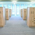
The outside bottom tiles are laminate in a beautiful vertical wood grain that complements the floor colour nicely, and on the inside each station has a whiteboard tile, which is perfect for teams that are collaborating within the office to jot down ideas and meeting notes. Down the spine each station has a flip up tile with beltline electrical and data above the surface for easy accessibility when electricity is needed without having to run multiple cables and wires throughout the system. These U-shaped stations flaunt a 48” corner, and a B/B/F combo tower with closed storage and wardrobes that are essential for storing personal items safely away and out of sight, while also giving the space a more luxurious and comfortable feel. Beauty was the main asset of this project and that is proven with the open end of the station encompassing a Scene kickstand post leg for a more aesthetic and cleaner look to pull the whole station together.
The Result
Risk & Insurance Consultants absolutely loved these workstations. So much so, that an additional 17 stations have been priced out for another area that was originally out of budget. Once they saw the stations with their company colors it truly hit home for the clients as they previously had used stations with very basic bland colors and this new way of showcasing a modern looking, clean workspace was the optimal solution for their problem.
